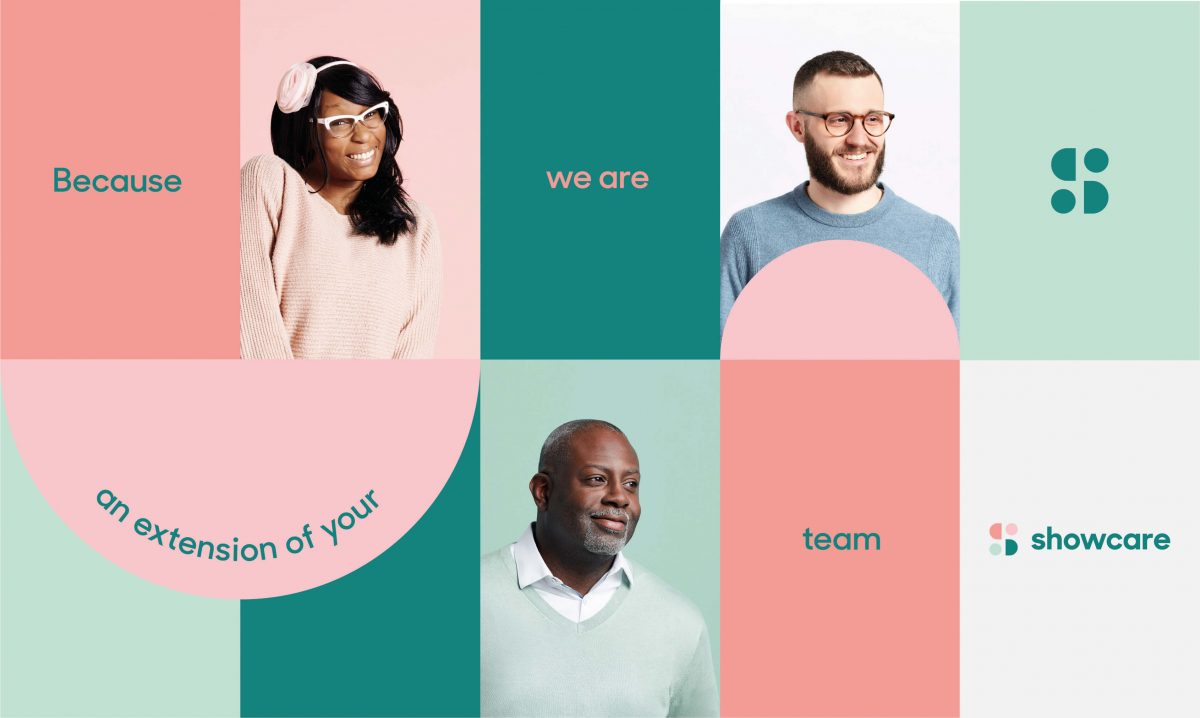
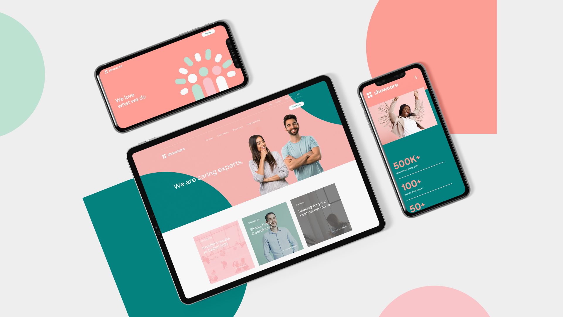
As the human-centric event experts, Showcare offers solutions that elevate the virtual and in-person event experience for attendees. Their new look now reflects their personality—fun, friendly, creative and always pushing the limits to deliver standout events.
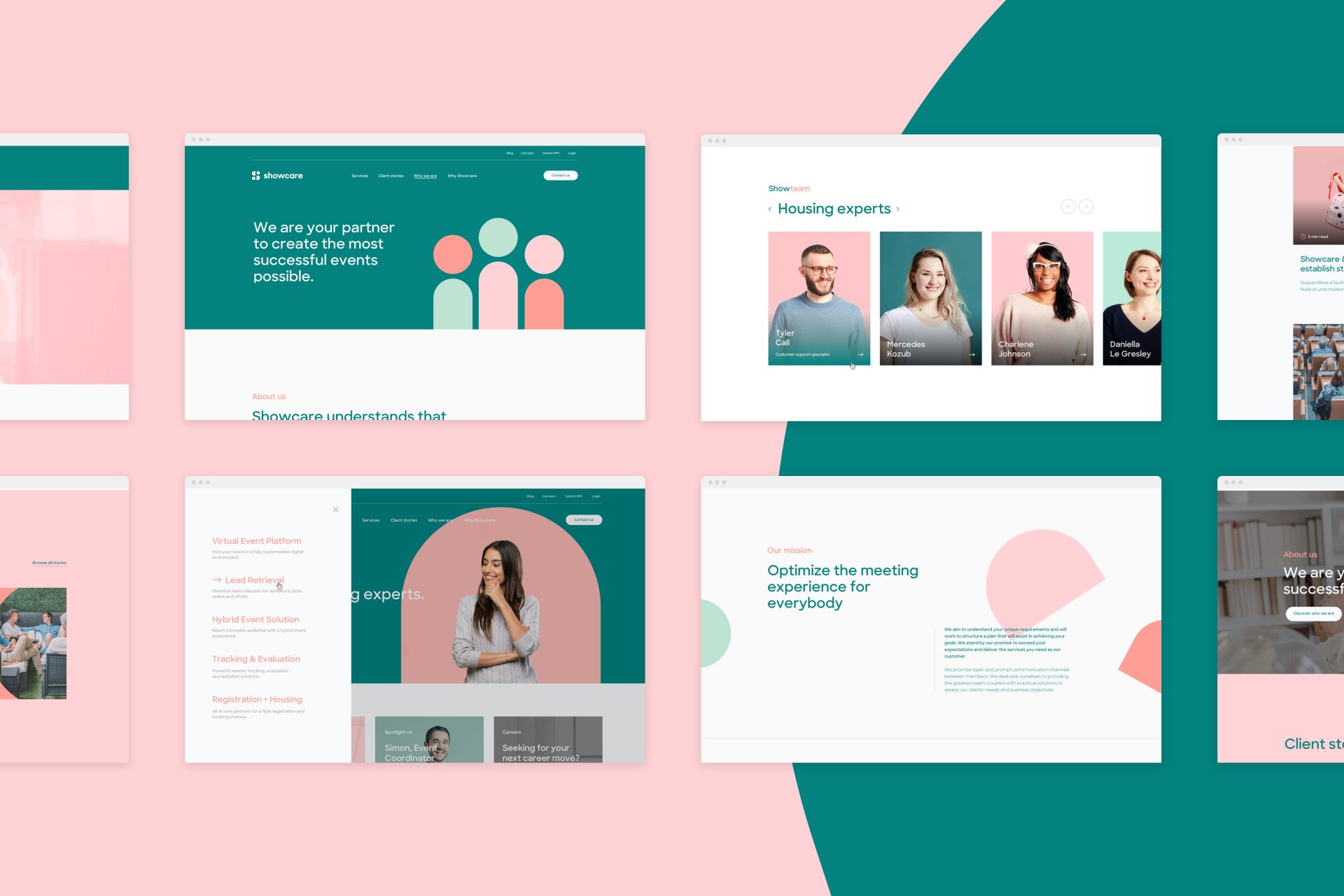
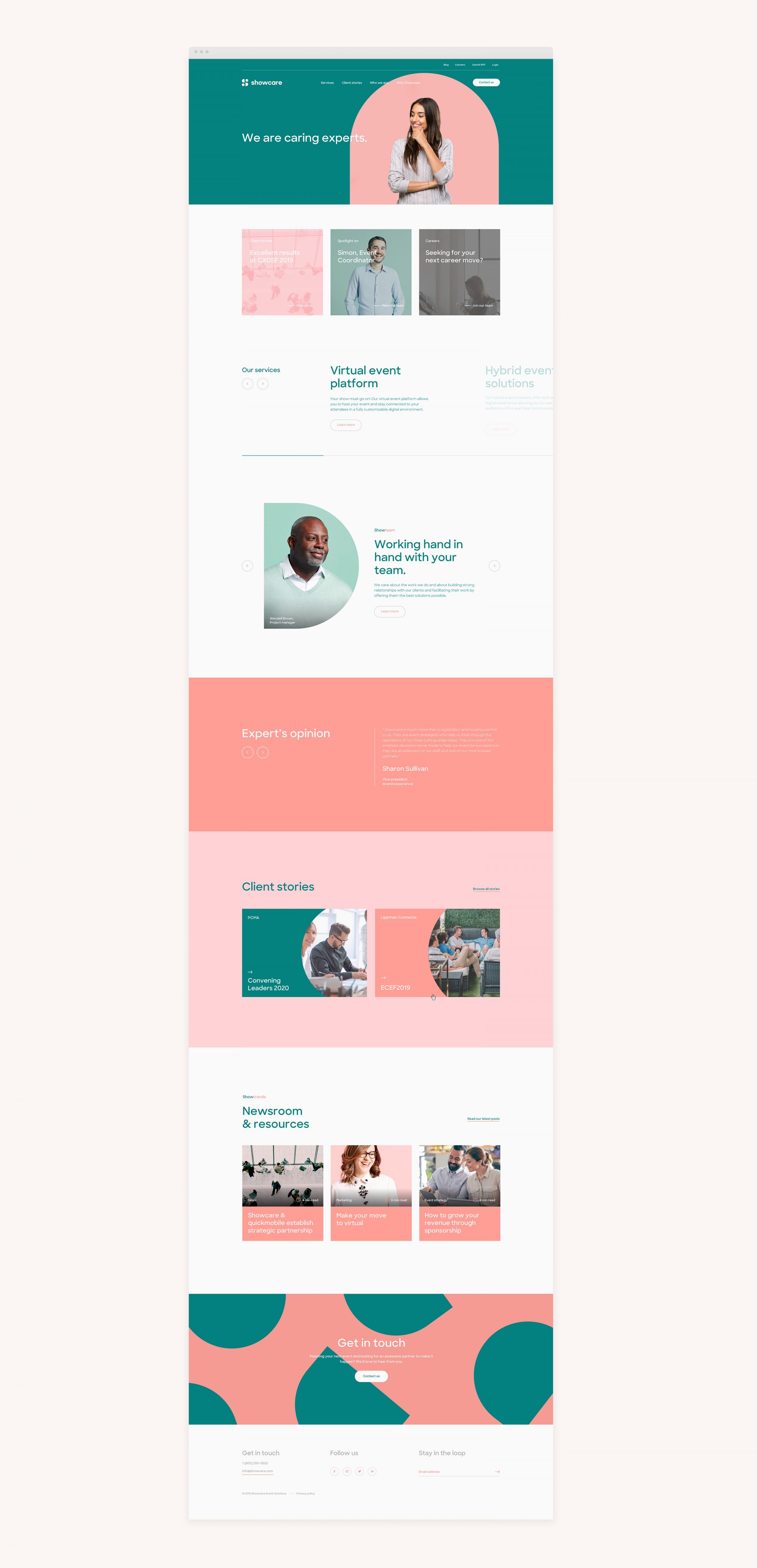
In reawakening this joyful and human-centred brand, we worked collaboratively with Showcare to question and understand the organization's legacy and ambitions to define their identity's guiding principles for years to come. Every detail of the identity was reconsidered and redesigned to better engage and communicate with their audience.

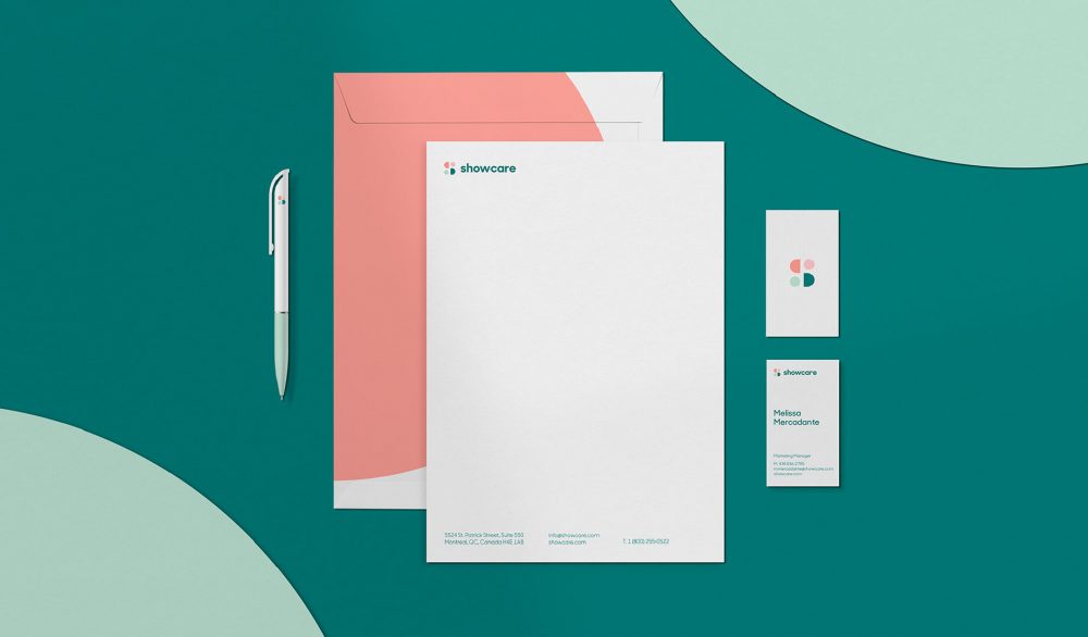
The visual identity emboldens this strategy by allowing Showcare designers and animators to unleash their creativity and make new things. Always colourful. Always playful.
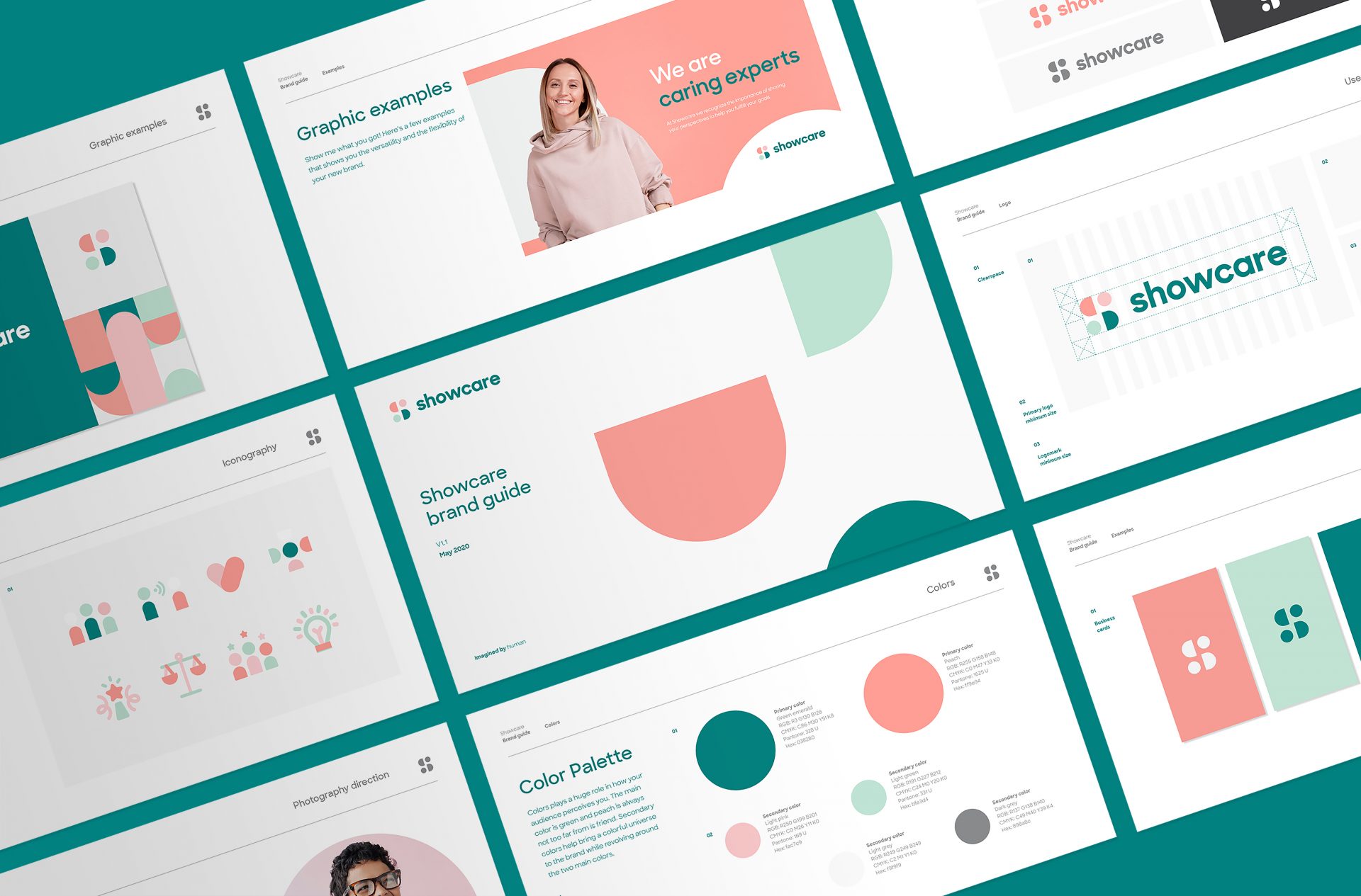
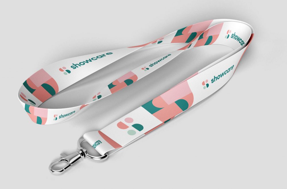
At first, we recreated the "S" icon out of two shapes: the "C" shape represents the care they put into everything they do, and the circles represent the human side, the relationship between Showcare and their clients. After updating the "S" brand icon, we broke it into the geometric shapes that form the basis for the brand's graphic language. Each piece can then be reassembled into an infinite array of possibilities.